A Good Portfolio Layout
takes into consideration the relationship between audience and creator. If the creator is a website designer, then it's more effective to make the portfolio interactive like a website than, say, a book. It also integrates the elements of design to make it easy to understand. Take
these helpful tips that illustrate what those are:
Here's an example of a layout that was "popular" in 2016, according to
this website; I think it'd still be quite popular today, too.
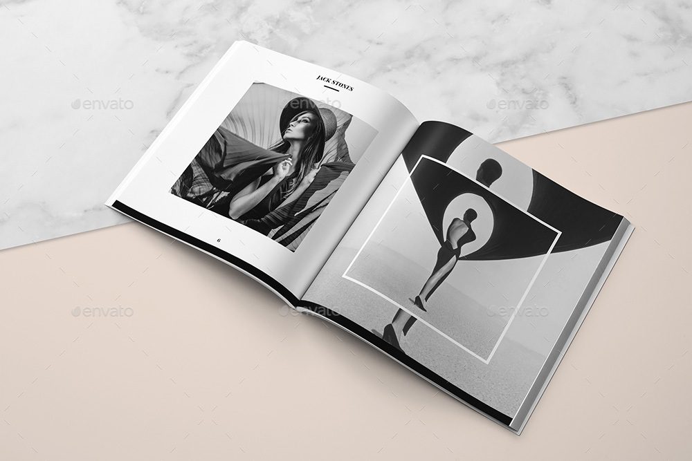
Here are some examples of documents that aren't portfolios, but incorporate those elements of design, like repetition, hierarchy of colors and typefaces. A sense of unity is key to creating a good portfolio. If the folios were separated, it would be easy to put them back together because they look similar. I like these in particular because
I don't like the one experimental typography one; I
do like that the text is used to form shapes and create movement, however I don't think it's very effective in being readable. The two in the bottom picture (Keith Lowe and Linda Olafsdottir) are really cool ideas I liked a lot. Maybe I could use a variation of that folding pamphlet idea for my infograph resume. I like to create thing with paper, like origami, and I used to make little comic books (I guess the accurate word would be zines now,) with my friends in grade school. I think a pamphlet type resume might illustrate my understandings of that.


Comments
Post a Comment